The Church Health clinic, which recently relocated to Crosstown Concourse in Memphis, Tenn., seized the opportunity of their move to study and optimize all aspects of their care delivery.
While some process changes are inevitably required when transitioning from multiple small spaces to a single large space, leaders took advantage of the chance to analyze, harness their strengths, and ensure the long-term viability of their business within the new space.
The methods used to study and prioritize during the transition were greatly successful and the clinic is thriving in its new home. Here are insights.
Drivers and Challenges
Several organizational drivers influenced the design of the new clinic, many of which sought to improve issues that had existed at the old facilities. The opportunity in the new facility was for leaders to plan flexible spaces they could adapt with changing practices.
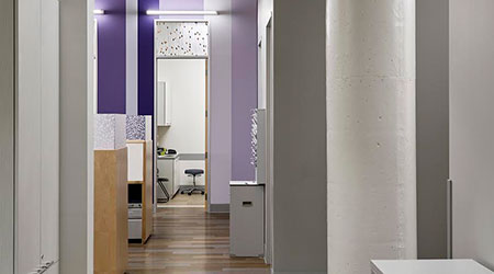
Light + Efficiency. Because the new facility was a blank slate, the clinic could meet specific needs as well as offer an efficient and aesthetically inspiring environment. The design team emphasized natural light to create a sense of openness.
This sense was key to enhance efficiency and help ease the transition to a much larger space. Designers also made a conscious effort to minimize walking distances for staff. Shared spaces were strategically located, and patient rooms were clustered so staff could operate smoothly from a central location.
Work spaces. Work spaces were another area emphasized in the new design. Nurses and other staff wanted to have a “home base.” Since the layout did not include offices, it was especially important to have a nurse’s station conveniently located with sight lines to patient rooms.
In addition to the nurse’s station, designated provider work spaces with a writing space and a door were added. This was a vast improvement over their previous configurations, where nurses and other providers took notes in the corridor, with seemingly constant disruptions.
Acoustics. Acoustics had been a challenge. Sound transmission between rooms was problematic when discussing private health matters, in that physicians and patients couldn’t hear one another without strain. A key requirement of the new space was speech intelligibility so that physicians and patients could speak quietly and still hear one another with comfort, accuracy, and privacy.
Operational Solutions, Design and Agility
Before outlining the priorities for the new facility’s design, the team met with staff and patients to solicit their perspective on key elements. Once these were identified, a means to successfully accomplish these as goals became the designers’ main driver.
Wayfinding + Signage. Signage started as the most basic required by building and fire codes. As the team observed travel through the space and what people asked about, they determined what types of signage were most needed and where. Then, they implemented only what was necessary.
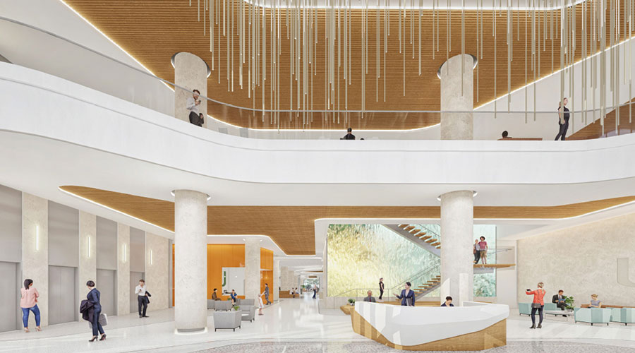
For the entryway, for instance, the team tested whether it was more effective to have greeters moving about the atrium, or standing behind a podium or small table. Multiple scenarios were tested before designers settled on a rolling display with room for two people.
This analysis is exemplary of the kind of attention to detail that is required for success in a new space—both for staff and patients.
Waiting areas. Waiting areas were orchestrated to support agility and flexibility in action. The concept of active exploration starts by observing where people congregate naturally. These observations, in turn, can provide clues on how to influence the paths of people wandering through the space and direct them toward certain features.
Furniture choice and placement can guide exploration of the space by creating cohesiveness from one area to another. The arrangement of the waiting and travel areas is constantly being refined as travel patterns play out.
Right-sizing space + Swing Space. Right-sizing space was important amidst such drastic scaling up. The design team carefully considered the sizes of pods and rooms to maximize efficient occupancy and reduce wait times by optimizing flow.
One of the keys was incorporating “swing spaces” that could change uses as needed. This is especially important in support of the mission to care for as many of the patients’ needs as possible on site, immediately, recognizing that the opportunity to do so in the near term may change.
The use of swing spaces was based on studies proving their success. In the swing spaces, furnishings could be changed to convert the space to different uses. They could serve as private rooms for behavioral health or any of the services Church Health provides – nutritional counseling, smoking cessation, etc.
Vertical adjacencies. Some surprises arose related to the way the design addressed project goals. For example, adjacencies—including vertical adjacencies—were an important part of the layout design. Sometimes the quickest, most direct route from point A to point B was a staircase.
Materials storage. In the spirit of optimizing flexibility and agility in the space, the team discussed materials storage. They kept quantities on hand to support their needs at any given time, restocking as needed. Bulk products, and items that required secure storage, were organized with day-to-day management in mind.
The goal was to make the storage locations accessible and so intuitive that staff didn’t have to give it a second thought, keeping their attention focused on patients.
Understanding design. Despite the obvious improvements,moving from a grouping of more than a dozen residential-scale buildings with varying square footage to a single enormous building was nonetheless a radical change.
One major disruptor was the scale of the space. When the space was under construction, it was hard for people walking through to visualize how it would look in its final state if they weren’t used to seeing the stages of demolition and construction.
Still, it was important for everyone to understand what was going on, so a design leader served as a master interpreter. That way, the process, and the staff’s understanding of it, was streamlined and cohesive.
Because of the attention to detail focused on the best layout and use of the space at Church Health, the care providers who work in the building know what they’re doing and why. The move enabled them to expand the clinic’s care side exponentially. The careful and deliberate design of the space to facilitate the clinicians’ work positioned them to make the phenomenal transition successful.
Insight
Competence + Communication. One of the keys to success in this project was a cohesive approach in which everyone understood the clinic’s vision and mission.
Additionally, the team’s competence and solid operational knowledge was bolstered by constant communication that emphasized transparency. Communication took a variety of forms, including meetings, brainstorming sessions, testing ideas on paper, layouts, and casual conversation. This ensured consensus and buy-in from all parties.
Signage. Signage was moveable and flexible—for example, with numbers on the rooms rather than names—so the rooms’ functions could change without requiring new signs. The spaces were scaled so that furniture could be moved around, while ample space was provided for wheelchairs and foot traffic in the corridors.
In this way, designers not only improved the present work; they also ensured the space’s future adaptability. This careful planning paid dividends when the clinic began operating in its new location.
Scale of rooms. The rooms’ scale is appropriate to accommodate functions and furniture, with a place for everything and room to perform basic functions.
Using the spaces was easier thanks to the consistency from room to room, with objects stored in predictable, convenient locations. The design team invested the budget into the fixed, permanent pieces, using less expensive and easier-to-manage solutions for elements that might change.
Refining care delivery. Future planning allows for a clear course of action built on plans rather than limitations. Care tasks can be broken down into basic functions, for a more manageable scale, and then fine-tuned based on how the organization works.
To support continuous improvement, designers observed how people worked in order to translate their activities into an environment that could serve those tasks. The designers broke down the components that worked into a care delivery process, and repeated the most successful ideas.
Navigating transition was critical in the face of some unknowns. Amid exponential growth, the Church Health clinic anticipated market changes and needed to plan to accomplish their objectives with the design team’s help.
Even with the best planning and implementation expertise, such a major change could still have some unexpected challenges. For example, the space’s condition was not static, even upon occupancy. The design team was performing necessary refinements, even after move-in, to optimize the space.
During periods of transition, the team therefore collected feedback and made changes to adapt as providers began to use the new space.
With the constant dynamic evolution of Church Health, project teams spent a good deal of time planning for “the future,” but the future ended up starting just months after clinicians and patients moved in. By analyzing workflows to optimize all aspects of care delivery, designers raised the bar, setting not just a new standard of excellence for clinic design, but also for thriving as an operation.
Rebecca Courtney, ASID, IIDA, is Principal with LRK and can be reached at rcourtney@lrk.com. Frank Ricks, FAIA, LEED AP, is Founding Principal with LRK and can be reached at fricks@lrk.com.

 Design Plays a Role in the Future of Healthcare
 Cedar Hill Regional Medical Center GW Health Officially Opens
 Designing Healthcare Facilities for Pediatric and Geriatric Populations
 Kaiser Permanente Announces New Hospital Tower at Sunnyside Medical Center
 Building Disaster Resilience Through Collaboration