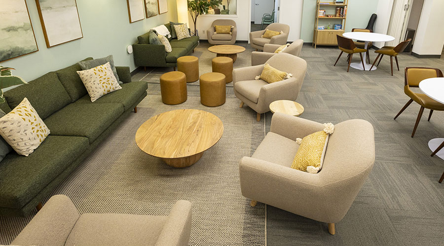
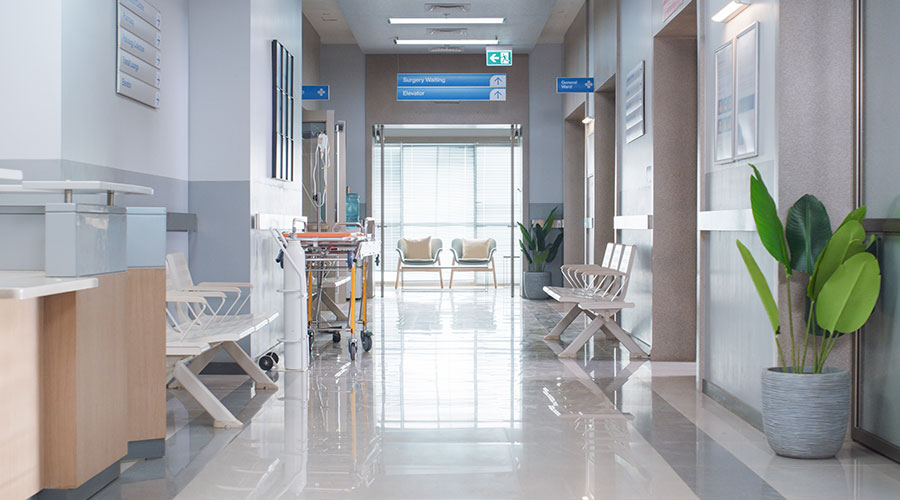
The latest color trends for healthcare spaces can help facility managers work with architects, designers and specifiers to maximize design to deliver functionality and a positive patient experience.
Color influences mood and can be a tool to shape the patient and guest experience. For example, the latest in evidence-based design research confirms the healing and calming powers of organic, natural colors when used in a healthcare setting.
By incorporating these tips, you can create a functional, aesthetically pleasing design in your facility project.
Peaceful power of neutrals
In an entryway, the right color can deliver a positive first impression. Soft and warm neutral hues are reminiscent of homelike spaces and communicate a sense of rest and security.
The tonal balance between warm browns and cool, alabaster neutrals works well for senior living and acute care spaces, offering a sense of sophistication that occupants find comforting. Use stress-reducing hues such as stone grays and fawn tans as a room’s main color. Pair neutral hues with hardwood flooring, ceramic tile and soft floral-hued accents for an overall design that is comfortable and inviting.
Functionality of color
Senior care centers are made to feel comfortable, but color can also make a space functional, aiding residents who are experiencing decreasing vision or stimulating patients with decreasing memory.
As eyes age, they naturally add a tint of yellow to what people see, changing the way colors and settings are perceived. For this reason, bright colors such as sunset oranges work well as a wayfinding tool. Use oranges and other strong colors to signify a hand railing or direct patients and guests to the dining room. Warm neutral buffs and sandy browns are also excellent choices.
For memory care centers, use color to identify common areas and influence the mood of residents in a space. Choose saturated rose-colored violets paired with soft but vibrant yellows in a kitchen, sparking activity and appetite. Pair powder blues with milky cream colors for patient rooms or calming common sitting areas.
Hues for healing
Spaces that incorporate hues found in nature can have a significant impact on healing, while enhancing the patient experience. Specify rich, earthy colors from the great outdoors, such as calming, water blue hues and refreshing grass greens. Natural colors, when paired with warm wood accents, bring a sense of organic authenticity to what can sometimes be a sterile and stark hospital environment.
Spa-like hues and a luxurious, high-end design aesthetic can also boost the patient experience. Add a gentle sophistication to patient rooms and intensive care corridors, using soft pinks and golden browns for a strong statement that matches the high-level service provided in the facility.
Jackie Jordan is the director of color marketing for Sherwin-Williams.

 Building Disaster Resilience Through Collaboration
 Amae Health Expands to New York City
 Hospital for Special Surgery Opens Two New Facilities in New Jersey
 Should We Be Testing Toilet Water in Patient Restrooms?
 Healthcare Union Petitions for Increased Staff Safety at HCA Florida Hospitals