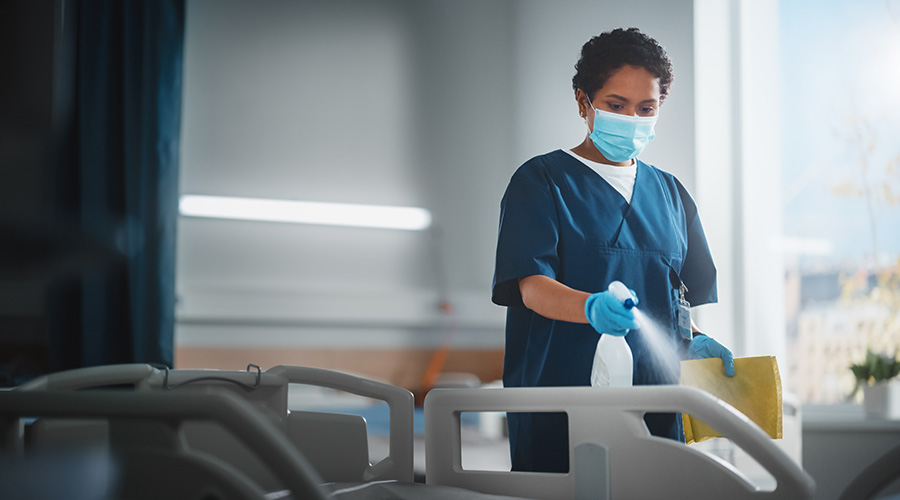
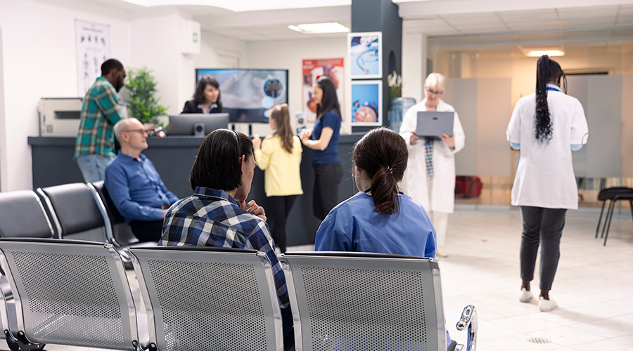
Interior design trends notoriously come and go, but in healthcare settings, decisions about the layout and aesthetics of a space carry extra weight. Studies have shown that design elements such as single rooms, nature views and sound-absorbing ceiling tiles contribute to the healing process. Here are four design trends that are evolving as healthcare designers shift their approach to provide a more restorative patient experience:
Visual quietness
The word quiet is generally associated with reducing audible noise, something healthcare facility managers are doing by streamlining alarm systems. But in facilities where concealing equipment behind cleverly designed cabinets is not a possibility, designers are turning more attention to visual quietness: coordinating the colors of medical devices, cords and other equipment with the colors of the walls and décor in hospital rooms and corridors. The idea is that a more monotone, cohesive look can reduce visual activity and create a more serene environment for patients, which in turn helps them rest and heal.
Coordinating the colors of products coming from a variety of vendors and contractors can be a challenge, especially with some designers homing in on details as small as the color of the glove boxes. But when executed effectively, this trend allows healthcare providers to hide equipment in plain sight and contributes to a more calming atmosphere for patients.
Wider corridors
Counterintuitive to most facilities, wider corridors have benefits to planning the way a patient floor can function better, whether it be public facing or back of house. Nothing screams hospital like a big, bustling nursing station situated in the middle of a dense patient floor.
As an alternative, healthcare designers are reducing the size of nurses’ stations and locating multiple smaller stations within a wider hospital corridor. Not tucked away, these compact stations are more visible for staff, patients and families and have a service-oriented feel similar to tech stores.
Wider corridors can also incorporate tables and chairs where patients and visitors can interact with hospital staff, a setup that is common in pediatric and mental health facilities. Finally, a wider hallway can also accommodate autonomous mobile robots and automated guided vehicles, enabling healthcare facilities to experiment with and adopt these innovative tools that could positively impact efficiency.
Electronic check-in kiosks
Futuristic check-in kiosks might seem like a way to boost convenience for patients, but some hospitals have experienced unexpected bumps in the road after implementing them. Staff and patients might have trouble using the kiosks. Moreover, the need for electronic kiosks is diminishing as mobile technology evolves and more people become accustomed to checking in via smartphone in settings such as concerts, movie theaters, airports and hotels.
Healthcare designers and facilities managers should consider kiosks in the context of each individual facility’s particular characteristics and patient needs and determine based on those factors whether they will contribute to a more seamless patient experience.
Modular construction
Modular wall construction has been around as a wall choice for many years, standardizing facilities and saving time and money in build and operational costs. Most recently, with technological enhancements, modular wall elements companies are being increasingly used to create flexible spaces for clinical uses. One example of achieving adaptive space is the re-use of former retail spaces as clinical spaces like doctors’ offices and primary care clinics.
Hospitals and healthcare facilities can grant patients access to lifesaving treatment, innovative medical technology and skilled care. In addition, these facilities provide those who are ill or injured with a serene place to rest and recuperate, and interior design plays an important role in creating spaces that achieve these goals.
Natasza Naczas is a project manager with Project Management Advisors (PMA).

 Two Steps to Controlling the Hot Zone
 RiverSpring Living Breaks Ground on River's Edge Senior Living Community
 Encompass Health Reveals Plans to Build Inpatient Rehabilitation Hospital in Post Falls, Idaho
 Creating Compassionate Spaces in Healthcare
 Study Shows Connection Between Odor and Patient Experience