Sometimes a building isn’t just a building. Occasionally, a building invites you to interact with it, injecting a moment of levity in your visit to a museum, gym, school, office, or hospital. And who appreciates those whimsical touches the most? Children. We brought this idea to our work on three new treatment centers for ErinoakKids, an organization that provides treatment, rehabilitation, and support services to children with a wide range of physical and developmental disabilities, communication disorders, and autism.
Our design at ErinoakKids focused on three pillars: play, achievement, and memory. We strove to infuse the buildings with elements of these pillars to engage ErinoakKids’ young clients.
Each of ErinoakKids’ three treatment centers – located in Mississauga, Brampton, and Oakville – gave us chances to think differently about standard building requirements and turn them into fun and engaging elements. If you’re looking at creating a dynamic healthcare space for children, here are six ways to inject creative touches into everyday design features:
1. Create playful seating
A sense of play seeps into each entrance space with fun, wavy benches. Kids might feel nervous walking into a treatment center, so we wanted to provide a playful and exciting space. We took a requirement – seating in an entrance area – and gave it a child-friendly twist.
2. Turn a staircase into a focal point
We needed to include a staircase that incorporated a large landing, since kids with mobility issues require a space to rest. Instead of developing a standard seating area on the landing, we designed a treehouse that engages both the interior spaces and the playground in the courtyard. The treehouse has become a focal point of the building. We also numbered the steps leading up to the treehouse, so children can gauge their progress while climbing the stairs. We turned a requirement for a landing into a central feature for the building, infusing play and achievement into a lively spot that stimulates a child’s imagination.
3. Inject artistic flair into your wayfinding
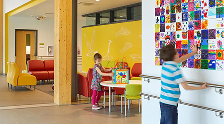
We approached wayfinding and art with play, achievement, and memory in mind. Each corridor at ErinoakKids features an accent color to help orient patients and staff. We decided to leave one wall white in every corridor, to create a blank canvas for artwork by patients in the form of hand-painted tiles. These ‘memory tiles’ let kids leave their unique mark on the building – something especially meaningful for patients that have been coming to ErinoakKids for years.
4. See possible disruptions as play opportunities
The Mississauga location presented us with a unique opportunity – how would we deal with the train tracks nearby? Are the trains an irritating disruption, or a form of entertainment? We took the second perspective. Instead of blocking the view of passing trains, we decided to embrace our inner sense of play by designing a trainspotting nook. It’s become a memorable feature of the play area.
Kids might feel nervous walking into a treatment center, so we wanted to provide a playful and exciting space.
5. Give kids an inside look
What do the inner workings of an elevator look like? At ErinoakKids, patients can get a glimpse at building machines that are usually unseen. We designed ‘truth windows’ throughout the treatment centers – in mechanical rooms, ceilings, and elevators – to teach kids about the building systems inside. Sections of the buildings contain see-through plexiglass surfaces so kids can learn about building systems inside. We designed brightly colored pipes and added timed lights to illuminate the mechanics and give kids a peek into the inner workings of the building.
6. Turn noise reduction features into fun elements
The pool at the Brampton location required us to design sound baffling to reduce the level of noise coming from the pool area. We took that requirement and gave it a playful twist by selecting colorful acoustic panels and creating a three-dimensional sculpture that resembles flying kites. The kites also serve a secondary purpose, as they can distract kids who need to spend most of their time in the pool on their backs for treatment.
If you’re tasked with working on a similar healthcare space, we hope you’re able to turn project requirements into occasions for joy and curiosity. Many people think of a building as a static structure, but a building can teach, entertain, and heal. It can invite you to behave in a different way.
Infuse your project with meaningful pillars – like play, memory, and achievement – and you’ll be rewarded with a satisfied client and happy users. Now, make that building come alive.
ErinoakKids was delivered via public private partnership (P3) procurement. Stantec served as the Proponent’s Designer and Architect of Record. Parkin Architects served as the Planning & Design Compliance (PDC) Architect.
Iva Radikova is the interior design lead in the Stantec Toronto office and Olivera Sipka is a senior architect focused on healthcare design.

 UF Health Hospitals Rely on Green Globes to Realize Their Full Potential
 How Healthcare Facilities Can Be Truly Disaster-Resilient
 TriasMD Breaks Ground on DISC Surgery Center for San Fernando Valley
 Bigfork Valley Hospital Falls Victim to Data Breach
 AI-Driven Facilities: Strategic Planning and Cost Management