D.C. sister clinics use color to brand shared space
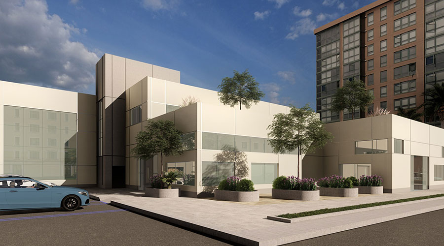
Designers saved space and maximize efficiencies by designing the two clinics with a shared reception and waiting area, according to an article on the Healthcare Design website
Designers saved space and maximize efficiencies by designing two sister clinics with a shared reception and waiting area, according to an article on the Healthcare Design website. Architectural details in each clinic’s brand colors (blue for Capital Aesthetic + Laser Center and green for Comprehensive Woundcare Services) were used to differentiate each space.
Read the article.
September 14, 2018
Topic Area:
Interior Design
Recent Posts
Case study: The process encouraged the team to push themselves in several areas.
Real resilience looks different than what’s written down in plans
It is set to open in Q3 2025
The incident occurred in November 2024
6 factors to ensure infrastructure, operations and financial management support AI’s integration

 UF Health Hospitals Rely on Green Globes to Realize Their Full Potential
 How Healthcare Facilities Can Be Truly Disaster-Resilient
 TriasMD Breaks Ground on DISC Surgery Center for San Fernando Valley
 Bigfork Valley Hospital Falls Victim to Data Breach
 AI-Driven Facilities: Strategic Planning and Cost Management