When installing art in a public building, it’s important that designers aren’t catering to just one type of person. For example, the color red can be culturally offensive to some, but beautiful to others. To combat that this, more designers are embracing regionalism and incorporating art from locals and using these pieces to teach the history of the location. This is especially helpful when it comes to wayfinding. With more hospitals and healthcare facilities incorporating artwork to better help patients, residents, visitors and employees navigate the building, it is important to choose options that benefit everyone. Healthcare Facilities Today recently spoke with Holly Ewing, senior interior project designer, Associate, Perkins&Will and Nicki Hellem, senior interior project manager, Senior Associate, Perkins&Will about how local art is helping facilities with their navigation troubles.
HFT: How can artwork effectively differentiate different areas or departments within a healthcare facility, making it easier for visitors to navigate?
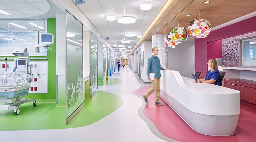
Nicki Hellem: Using themes as well as consistent colors integrated into the interior design and art for specific departments greatly enhances traditional wayfinding. For example, incorporating more sophisticated pieces into an Adult ICU versus more playful pieces into a Pediatric ICU makes the areas intuitively distinct to a visitor or patient.
There are trends we’ve noticed in the themes chosen for certain areas. Landscapes tend to be used in patient care areas such as patient rooms, infusion bays, or imaging suites. Other examples are land and water animals for pediatric settings or a stork in Mother and Baby suites. We see more florals or feminine pieces and designs within Women’s Services as well.
HFT: How can technology be incorporated with art to enhance wayfinding in healthcare settings?
Holly Ewing: We have had a client request digital art that slowly changes scenes like a computer wallpaper background. It was intended for an ICU waiting area, which is a nice touch because people there are going to be sitting for long periods of time, and this art piece creates some variety.
There is a lot of new technology being integrated into lighting and creating more interactive and dynamic art installations in circulation spaces. This can feel fresh and intriguing, energizing the space and helping people pause and feel present in their surroundings.
It’s important to not rely too heavily on technology as an integral part of wayfinding, though. You need Facilities or outsourced consultant companies to be able to maintain that piece of technology over time, or there has to be flexible design so that if the piece of equipment is broken or outdated, it can easily be replaced. Too often we’ve seen pieces that looked great on Day 1 but after a few years it’s just an unused black screen.
HFT: Are there any budget-friendly options or strategies for incorporating art into wayfinding systems in these facilities?
Hellem: Generally the more custom art pieces are selected for public spaces and near the entry of patient care units where wayfinding is needed most. Framed prints or prints on canvases are then used for back-of-the-house spaces when the budget is tight.
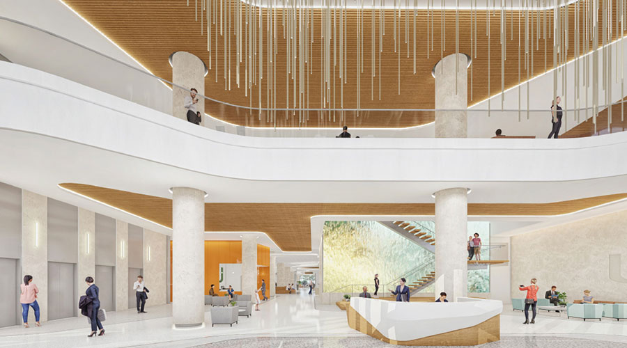
Ewing: Quality over quantity. Rather than using several smaller pieces scattered around an area, determine where your high-impact areas and decision points are and spend your money there on more memorable pieces. Having a large, distinct piece at a threshold or intersection will have greater value and create more of an impact in your memory than standard signage or a corridor of prints.
Imagine you’re giving someone directions. Think of how simple it is to say and to follow instructions like turn left at the pink house, then right at the giant century plant. With wayfinding in healthcare design, you’re painting a mental picture—a visual road map of how to get from the parking lot to a specific destination in a hospital. Art pieces at key decision points can even be included in printed or digital maps of the hospital to help people visualize where they are without overwhelming the space with too much signage. (A great example of this is Northpark Mall here in Dallas, Texas).
HFT: How can art be used to engage and stimulate cognitive function in patient care settings while aiding their navigation?
Ewing: Research has shown that using biophilic design elements helps improve the mental health and well-being of staff, family, and patients. One of the ways to incorporate those elements into a space is with art. By using pieces that mimic nature, such as soft forms and a layering of textures, we can help people feel more at ease and create a sense of well-being. Art that feels familiar to people is especially effective. Maybe it’s the subject matter that reflects their culture, their community, or their natural surroundings. This can make people feel like they belong. It can calm their thoughts and help them focus on the present moment as they navigate their environment and healthcare journey.
Something else we do is think about how memorable a piece is, and whether it’s located in a place a patient will be passing through or potentially spending a large amount of time. In high-impact public spaces, the art can be more striking and memorable, but as you get deeper into patient spaces, like in a patient room, we typically switch to landscape or nature imagery in calming colors so that people’s minds can escape into them. We want to put people at ease and signal that it’s okay to stay a while, that you have reached your destination and can relax and heal.
Some family members can be visiting their loved ones in the hospital for weeks or months at a time. Having something that changes with the seasons, that simulates movement or the passage of time, also helps with people’s mental state and how they perceive space and time.
HFT: Are there any specific considerations for selecting art that is suitable for individuals with visual impairments or cognitive challenges in healthcare or senior care environments?
Hellem: In healthcare there are many different settings that we focus on depending on the department. For the aging population and in behavioral health settings, we avoid art that could cause confusion, vertigo, anxiety, or any intense emotions when viewing it. Artwork incorporating nature and biophilic components is key for these types of settings. This will help reduce cortisol levels while improving cognitive function.
As people age, eyesight changes, and colors tend to be perceived as more yellow. We keep that in mind when selecting pieces. For a Labor and Delivery or Postpartum suite, we will intentionally not select art with moms and babies to be sensitive to those more difficult deliveries and moments. For pediatrics, we will focus on the artwork as a positive distraction for the patients, families, and siblings of patients. Incorporating interactive pieces is key, whether it is an art piece that is a ‘seek and find’ or utilizes technology for the children to interact with while in the hospital.
Mackenna Moralez is the associate editor for the facilities market.

 Design Plays a Role in the Future of Healthcare
 Cedar Hill Regional Medical Center GW Health Officially Opens
 Designing Healthcare Facilities for Pediatric and Geriatric Populations
 Kaiser Permanente Announces New Hospital Tower at Sunnyside Medical Center
 Building Disaster Resilience Through Collaboration