It seems like nearly everyone has a memory of one of their parents refusing to stop to ask for directions, causing tension and embarrassment for everyone in the family as they continued to get more and more lost. As time passes, this could be a funny memory to share at future gatherings, but as you get older the feeling of being lost isn’t as easy to shake off anymore.
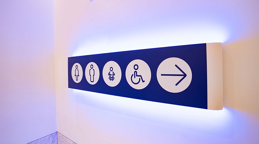
In senior care facilities, it is important that residents can navigate their spaces. One of the ways to ensure this is with clear signage. Healthcare Facilities recently spoke with Jill Quam and Tiffany Petri, interior designers with Wold Architects and Engineers on how the benefits of signage can make wayfinding easier.
HFT: How can designers incorporate clear and intuitive signage that is easy to read and understand for seniors?
Quam and Petri: Signage needs to be clear, direct, flexible and enhance the space at the community. Lettering on signage should have a clear San serif type face with verbiage that contrasts from its background so its easy to read; additionally, signage needs to meet ADA guidelines and include tactile features on the signage such as raised letters and braille as required for each room + occupancy type. Each sign should be direct + concise in labeling the room type along with direction signage for the overall community. In larger community have coordination building plans with a mark showing where you are in the building can aid in providing clear wayfinding with the direction signage. As programing for communal spaces and staff areas can change over time it important to develop signage that can be flexible staff to update so current + new residents, visitors + staff all have the same understanding of each space type to assist with wayfinding. Finally, Implementing more decorative signage for some amenity areas such as dining + café areas, salons, bar lounge or fitness areas provide clear intuitive direction while giving an upscale aesthetic to the community.
Related: Designers Use Art for Wayfinding in Healthcare Facilities
HFT: How can wayfinding design prioritize safety and security for seniors, ensuring they can easily navigate without feeling lost or vulnerable?
Quam and Petri: Signage is an important asset in providing communication within a senior living environment; it needs to provide clear + direct messaging, easy to ready and be consistently located throughout the community. Emergency response features can be incorporated into wayfinding signage so that residents can access emergency buttons or call for help. Wayfinding to including providing clear directions to authorized staff areas such as medical supply, vital supply and equipment rooms for emergency situations, and staff only areas. if incorporating well thought out wayfinding the environment will promote seniors to have confidence to navigate spaces, aiding in their independence, and keep efficient circulation within their community.
HFT: How can natural landmarks, interior design elements or themed areas be integrated into the wayfinding system to create memorable and functional navigation cues?
Quam and Petri: Utilizing focal landmarks and situating a building on site to provide a view of the interior you can create wayfinding within the building to amenity spaces around using the view as the driver to draw people into those spaces. Design elements that can be implemented are decorative architectural features, changes in flooring patterns, accent walls, color + texture implementation. Implementing these same elements to create distinctive differences between neighborhoods or wings of buildings aids in navigations while maintaining a cohesiveness in the design. Simple items as change in wall color, artwork and living wall of plans + change ins ceiling design or furniture arrangement all aid in providing direction in the design for wayfinding. Clear, direct, and consistent signage throughout the community aids in navigation, one unique signage element especially to memory care communities are “memory shadow boxes” that are placed at the resident’s door to aid in in guiding them to their apartment. While this a simple design element it aids in prioritizing safety + security to ensure resident can easily navigate within their community.
Mackenna Moralez is the associate editor of the facilities market.

 How Healthcare Facilities Can Be Truly Disaster-Resilient
 TriasMD Breaks Ground on DISC Surgery Center for San Fernando Valley
 Bigfork Valley Hospital Falls Victim to Data Breach
 AI-Driven Facilities: Strategic Planning and Cost Management
  Double Homicide Suspect Hides from Police in Upstate Community Hospital