As part of a series of collaborations with Hackensack Meridian Health (HMH), architecture and design firm FCA was tasked with reimagining an existing retail space into a fully functional ambulatory care center. Completed in September 2022, the Hackensack Meridian Health and Wellness Center at Eatontown is a 45,000-square-foot out-patient facility that accommodates cardiac and primary care, in addition to imaging, neurology, lab, physical therapy and women's oncology spaces. The Eatontown location, like other locations under development and construction, accommodates a separate urgent care suite with a dedicated entrance, which was fast-tracked ahead of the remaining building fit-out. The project marks the first prototype of a community-based, out-patient center as the network aims to consolidate locations and enhance access to its ambulatory practices, and urgent care.
The prototypical medical center creates a new standard for HMH’s ambulatory care facilities, and will help to establish a uniform and recognizable identity across subsequent properties. This provides a sense of familiarity for patients by standardizing the experience, instilling greater confidence in the patient care system itself, and equipping healthcare practitioners with the confidence to work at multiple locations with comparable layouts and design features. The new facility also brings various outpatient practices together under one roof, increasing ease of access and convenience by providing the option to visit multiple providers at a single location. These new suites accommodate cardiac and primary care, imaging, neurology, labs, physical therapy, and women’s oncology. This community-based center and urgent care works to ensure that the surrounding community can access the care they need with ease.
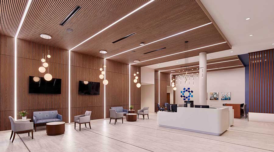
Located within an existing strip mall, initial phasing of the medical center involved the adaptive reuse of a former Toys “R” Us retail store. The design team skillfully reimagined the building’s exterior with prominent signage and blue awnings, reflective of Hackensack Meridian Health’s iconic logo and overarching brand. Internally, the design team worked to maximize the large footprint, creating clear pathways to various destinations throughout the space. Upon entering the building, guests are greeted by a modern and inviting lobby waiting area, complete with a welcome desk and convenient check-in kiosks located centrally. These kiosks enhance patient experience, and create a central point for guests to check in without the need to sign in for each specialist visit, no matter its location in the facility. The lobby’s neutral color palette creates a calming atmosphere, while wood-faced acoustic panels on the walls and ceiling not only add a touch of elegance, but also help to minimize noise created by high ceiling heights, a remnant of the former retail space. This custom installation and Frasch’s acoustic design are completed with metal trimming around panels with LED lighting incorporated throughout. Elegant pendant light fixtures hang above the greeter desk and seating areas, further illuminating the space.
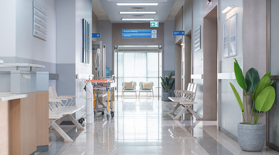
Progressing from the lobby, a spacious East/West concourse leads to most of the clinics, complemented by smaller North/South corridors that include several ancillary entrances. Each corridor introduces a dedicated accent color, intended to assist wayfinding with decorative light fixtures to help visually identify entrances. FCA grouped similar practices together, situating the OB/GYN and women’s oncology suite in the same vicinity, enhancing privacy and allowing women to occupy most of the shared waiting area. To create an illusion of spaciousness, waiting areas are defined by demountable frosted glass walls, left clear at the top to maintain clear sight lines and corridor visibility. Clinic entries are adorned with wood finishes, with the corridor’s associated accent color reflected throughout the rest of the suite. Exam room aesthetics are also clean and simple, with neutral accent paint and flooring alongside antibacterial materials for high-contact surfaces. Sliding wooden doors with frosted glass maximize available space and simultaneously create an efficient size module to maximize the number of available exam rooms, increasing patient access.

 Oracle Health Hit by Data Breach, Patient Data Possibly Compromised
 Ground Broken on New MD Anderson Sugar Land Facility
 Florida State University Reveals Plans for Panama City Beach Hospital
 The Effect of Over-Cleaning on Human Health
 Rumored Terror Threat to Hospitals Prompts FBI Warning