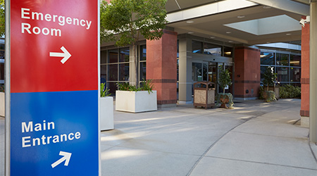
Signage in hospitals and other healthcare facilities is a critical resource for helping patients, residents, employees and visitors find their way around buildings. Since the onset of COVID-19, less support staff have been available to give directions. Wayfinding has increased its presence in order to better promote social distancing and further protect occupants of and visitors to healthcare facilities.
“Wayfinding is essential in design to simplify and guide the public through the myriad of corridors and spaces,” says James Standing, senior interior designer with Oculus Inc. “It helps to identify secure areas. Wayfinding can help in establishing a facility’s branding. It can be both physical and subliminal, using visual cues without adding to sensory overload due to over signing or other physical elements creating a chaotic and stressful atmosphere. Thoughtful wayfinding draws you where you need to go.”
Wayfinding offers additional benefits, though. Wayfinding difficulties drive a gap between cognitive mapping and anticipated movement, creating unnecessary confusion. Often, when patients enter healthcare facilities, their stress levels are already elevated. Proper signage allows people to navigate the space in a way that eliminates potential challenges.
“The hierarchy of wayfinding has been developed throughout literature,” says Joshua D. Crews, regional practice leader with NELSON Worldwide. “The highest level begins with architectural intervention and nodes, moving to vistas and visual cues, and the lowest level of wayfinding is within signage and color, while at the lowest level within the wayfinding hierarchy, signage and color are critical to navigating unknown spaces. Existing healthcare facilities have recognized the impacts of color and signage and implemented strategies to create clear travel paths for patients, families and visitors. New facilities are addressing wayfinding with high level interventions, such as vistas clear tectonics.”
Navigation points in urban hospitals are especially essential. It does not matter how often a person has visited the healthcare facility. The sheer size and volume of these spaces can be overwhelming. It is important for patients and visitors to understand where designated parking areas are before leaving their homes so no time is wasted before an appointment.
“Wayfinding is not intended to ease that inherent anxiety,” says Ali Summerford, interior design director with Oculus Inc. “Its purpose is to subconsciously guide visitors to their destination safely and as quick as possible with the least amount of disruption to other areas. Tools like easy-to-read hospital directories, color-coded campus maps and updated construction areas should be a part of a hospital’s wayfinding and signage process.”
Pandemic’s influence on wayfinding
As the COVID-19 pandemic continues, digital signage has proven to be a helpful tool as protocols within healthcare facilities have continually changed to accommodate the virus. Crews says using digital signs allows for a more flexible solution for visitors and allows them to see any changes made in real time. But technology can become an issue for older patients and those with sensory issues. Some interactive displays can also be difficult to see, navigate and understand, adding more stress to visitors.
“Digital signs can almost become an art and can aide in decluttering an area, but like anything else, you can overdo it,” says Hannah Rohlfing, interior designer with Oculus Inc. “They are good for hub areas and building directories because it’s easier and more cost effective to change and update more often than traditional signage.”
The biggest changes since the pandemic began have taken place at the entrances to healthcare facilities. Strategies have been implemented to funnel visitors through entrances where metal detectors, basic health questions, and screenings establish one’s ability to enter the facility. Meanwhile, designers are being asked to change the floor patterning at the 6-foot mark from the desk to encourage social distancing through visual cues. While the pandemic has not caused many changes to layouts of buildings, Rohlfing predicts that tight patterning around reception desks will continue to be a trend as the pandemic settles down.
“The hospitality concept of more open spaces was being pushed harder and harder prior to the pandemic,” Summerford says. “This trend obviously came to a hard stop once the pandemic hit. Plexiglass and social distancing markers became the new normal, and many hospitals may opt to keep these in place to help with HIPPA practices. People are heightened about everything related to COVID — signage about wearing masks, staying 6 feet apart and washing hands can be information overload. We need to look at removing the clutter and determine what the most impactful signage looks like moving forward.”
Regular re-evaluation
With regulations and protocols constantly changing in hospitals and other healthcare facilities, it is crucial that designers regularly evaluate wayfinding solutions to ensure they are used appropriately and effectively. Crews suggests analyzing space syntax first in order to identify locations where signage will be the most helpful.
“You always need to be aware of who is utilizing the space, from an employee, patient or visitor point of view,” Summerford says. “You need to be able to find a happy medium and create wayfinding that everyone can utilize. Some ways this can be completed are by taking the time to reach out to the staff that are typically stopped and asked how to find places by patients and visitors.
“Consider polling new staff within the first week of starting at the hospital about what they had issues locating and how they resolved it. Ask junior staff members on the design team to navigate their way to specific areas of the hospital without any support or floor plans and document their issues and successes.”
All signage must be interconnected. Color, contrast and clarity in directions are important for wayfinding. Along with asking staff members, Standing suggests designers poll patients and visitors on ways they can improve in other areas.
“In wayfinding, the architectural and interior design components are just as important as signs in hospitals and healthcare settings,” Rohlfing says. “These elements need to work with and support each other people who are colorblind cannot rely on colors for wayfinding, so floor patterning and clear, contrasting visuals like clouds over an information desk are important layers for that population.”
Wayfinding starts the moment a visitor enters the campus, and it needs to help that person maneuver a challenging environment quickly and stress-free. Historically, wayfinding was just signage, but now it has evolved to a crucial way to communicate with staff, patients and visitors. The use of finishes, lighting, patterns and markers is paramount in creating a stress-free environment.
Mackenna Moralez is assistant editor with Healthcare Facilities Today.

 UF Health Hospitals Rely on Green Globes to Realize Their Full Potential
 How Healthcare Facilities Can Be Truly Disaster-Resilient
 TriasMD Breaks Ground on DISC Surgery Center for San Fernando Valley
 Bigfork Valley Hospital Falls Victim to Data Breach
 AI-Driven Facilities: Strategic Planning and Cost Management