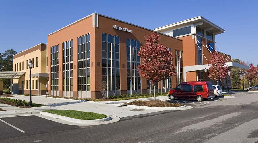
Several healthcare companies are turning to façade design to start making a connection with patients, according to a blog by Healthcare Design magazine senior editor Anne DiNardo.
These exterior design examples take advantage of the opportunity to create a positive memory.
DiNardo singles out these buildings as primed examples of memorable facades.
• Queensland Children’s Hospital in Brisbane, Australia. has an attention-grabbing un-institutional exterior, with colorful fins mounted on the exterior to provide extensive sunshading.
• Mercy Health Rookwood Medical Center in Cincinnati has a colorful exterior skin—executed in three colors of metal panels—that echoes Mercy Health’s brand colors, with a pattern in two shades of blue at the corner most visible from the freeway and transitioning to white panels at the front door.
• Mount Elizabeth Novena Hospital conveys “high-tech” as well as “warm and inviting” to the competitive healthcare market in Singapore. The first three stories of the building are clad in stone. The patient tower is covered in polished aluminum and glass.
• Kaiser Permanente Westside Medical Center in Oregon’s Hillsboro neighborhood has regional materials palette on the exterior, an outdoor plaza with local sculptures and water features, pedestrian walkways, and parking garage adorned with live hanging plants.
Read the blog.

 Medical Outpatient Buildings: 4 Trends Bringing Risk, Opportunity
 Building Senior Care Facilities for Harsh Temperatures
 Nemours Children's Health Opens the Betty and Jack Demetree Family Center for Otolaryngology
 Laser Scanning: Reducing Risk in Construction Projects
 MOBs Get Smarter and More Complex as Space Pressures Mount