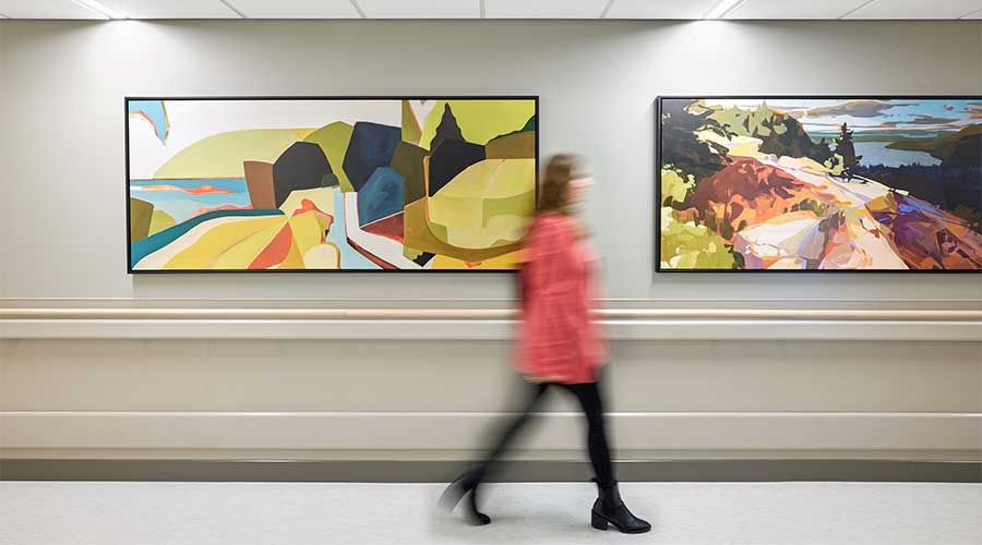
Art continuously enriches our lives. It can evoke the deepest emotions that we keep hidden within ourselves, often bringing someone to tears. But there’s more to art than just entertainment. Hospitals and other healthcare facilities have utilized art to guide patients and visitors to new areas of the building and incorporate local elements to make people feel more at home. Healthcare Facilities Today recently spoke with Holly Ewing, senior interior project designer, associate, Perkins&Will and Nicki Hellem, senior interior project manager, senior associate, Perkins&Will about how art can continue to transform healthcare facilities.
HFT: How can art be effectively utilized to enhance wayfinding in hospitals and other healthcare facilities?
Nicki Hellem: Wayfinding is one of the most complex elements of healthcare design, and it shouldn’t rely solely on signage. These buildings and systems can be overwhelming, especially in moments of high anxiety for patients and their families. Incorporating artwork into the architecture of the space is an effective way to create landmarks, ease difficult emotions, and intuitively guide visitors. Artwork, interior design, and traditional signage should be integrated for a fully cohesive wayfinding strategy. Custom art, for example, is a great way to help people navigate hospitals more efficiently.
HFT: What factors should be considered when selecting artwork for wayfinding purposes in these facilities?
Holly Ewing: There are four main factors to consider when choosing artwork to aid wayfinding: scale, color, branding, and variety.
With scale and color, think of guiding people from public spaces to more private areas within the facility using art that mirrors the group in each space: large pieces and more vibrant, colorful, abstract art do well in larger, public spaces with a more diverse group, but as you go deeper into the patient, family, and staff journey the art should become smaller and more organic, detailed, and soothing. This creates an intuitive, memorable flow and clear visual guidance that fits proportionally with the size of each space type.
Branding can be useful in high-impact public spaces. The hospital brand color or logo, for example, is a strong tool that can help subtly communicate that you are at an important point in your navigation. Variety is another factor to consider. You don’t want to use all framed art, for example. A variety of mediums, textures, and forms can still be cohesive while differentiating spaces with distinct touchpoints.
HFT: Are there specific types or styles of art that are more beneficial for aiding navigation in healthcare settings?
Ewing: When possible, you definitely want something more sculptural and airy to create that sense of movement, transparency, and texture that gives us comfort. It makes you stop, pause whatever thoughts are going through your brain, and appreciate the beauty of the moment. That little pause in all the stress you are feeling at the hospital gives you a second to breathe and clarity to think about where you need to go next.
You want the art in your public lobbies and circulation areas to be commissioned pieces of different mediums that are large in scale and more abstract. The staff lounge will have medium-sized pieces, maybe framed prints. The smaller rooms, like offices and exam rooms, get more prints and photography.
Sometimes we incorporate supergraphics into patient spaces to help with wayfinding. For instance, in the PICU and NICU at Renown Health’s Tahoe 5, we used a single graphic going down the corridor, but it changes colors as it progresses. When families or patients are out walking around, their room is easier to find and return to, because it has an identity based in color. We’ve heard similar comments from nursing staff. They say this type of color progression and color-coding makes it easier to identify which patient rooms they are caring for, or which nurse station is there. The supergraphics are printed on rigid sheet, so they’re easy to clean, and they provide protection to the wall.
HFT: Are there any specific guidelines or best practices for incorporating art into wayfinding signage or systems in these facilities?
Hellem: Creating ‘landmarks’ in public areas at elevator lobbies or larger waiting areas will help patients and visitors know they’ve arrived at a destination or a decision point.
Ewing: Donor signage in a hospital can quickly start to clutter the field of vision, making it hard to know where to look. The best practice is to have one central location to honor donors rather than plaques or stand-off letters, for example, that can get out of hand in a hurry. Playing with scale and/or color to signify different donation contributions can make the donor signage an art piece and high-impact opportunity in itself. That is something that can be added to over time.
The art program in a healthcare facility should be celebrated, especially when using local artists. I think it’s great when there is a plaque next to commissioned artwork that tells you about the artist and the selected piece. This does a few things: it creates layers of visual cues or identifiers that help you better remember the space you’re in, and it helps you feel more connected to your surroundings and the community around you, in turn giving you a sense of calm and ease.
Mackenna Moralez is the associate editor of the facilities market.

 UF Health Hospitals Rely on Green Globes to Realize Their Full Potential
 How Healthcare Facilities Can Be Truly Disaster-Resilient
 TriasMD Breaks Ground on DISC Surgery Center for San Fernando Valley
 Bigfork Valley Hospital Falls Victim to Data Breach
 AI-Driven Facilities: Strategic Planning and Cost Management