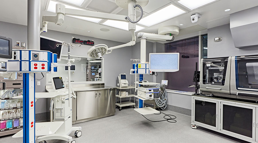
When Cameron Memorial Community Hospital planned the new campus in Angola, Ind., it chose of to remain in the heart of the city and focus on safety and confort,according to an article on the WTVBAM website.
We also gave much thought to the appearance of the hospital to maintain the look and feel of the residential community around the campus. We wanted to complement the area — not disrupt it,” Cameron President and CEO Greg Burns said in the article.
The brick materials and window styles for the new hospital were deliberately chosen to complement downtown buildings. Warm materials were used, a unique approach from the commercial feel of many hospitals, the article said.
Another high priority was patient and guest comfort. Studies have shown that hospital layouts can be confusing and difficult to navigate, the article said. Cameron was designed to create a flow and circulation pattern marked by visual cues both inside and outside of the building.
Entering the building at the main entrance, visitors can see through the dining area outside to the Healing Garden, affording a reference point when navigating the hospital. Upon entering the hospital at the main entrance, visitors will be welcomed by a customer service representative to offer wayfinding and other assistance.

 Thousands of Healthcare Workers Laid Off
 Construction Tops Off at Hackensack Meridian Health and Wellness Center
 8 Operational Considerations for All-Electric Central Plants
 Novant Health Breaks Ground on New Facilities in South Carolina
 Building an Organ Regeneration Lab at UHN's Toronto General Hospital