Hospital signage and wayfinding often encounter issues related to cost, complexity, and maintenance. To address these common challenges, Kolano Design was chosen to help develop a new vision institute.
The newly developed vision institute is a pioneering facility conducting research and providing care for individuals with specific vision needs. Kolano Design seized the opportunity to create equally unique signage and wayfinding solutions, both inside and outside the completed facility.
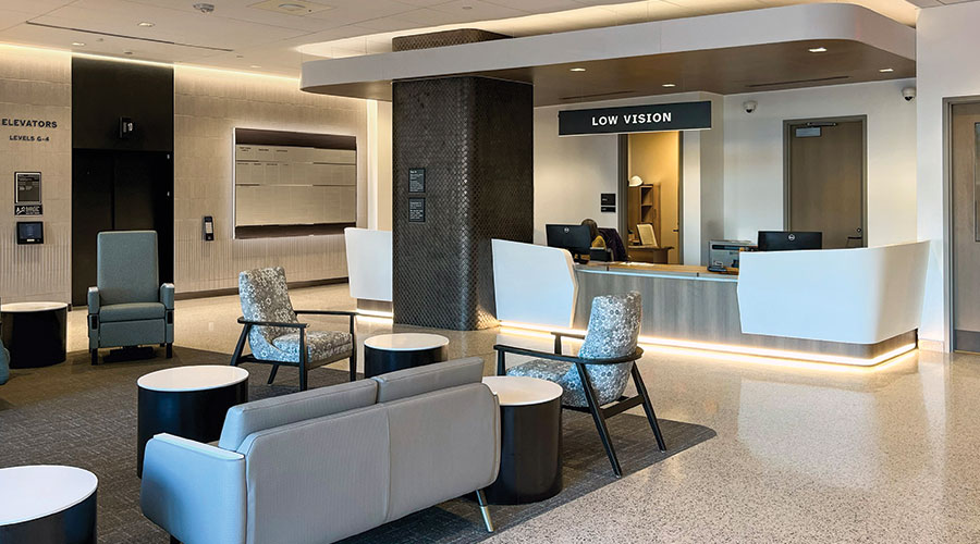
The finalized signage and wayfinding system offers directional, informative, and regulatory information to patients, staff, and visitors. It enhances accessibility throughout the facility and improves the overall patient experience. Bill Kolano (Principal) and Douglas Donaldson (Senior Project Manager) collaborated with designers Aaron Woodward and Adam Killen to develop the unique sign system. The Kolano Design team identified the optimal locations for sign placement, considering the building’s architecture, wall finish colors and traffic flow.
Kolano Design conducted research to understand how patients with low vision (or no vision) navigate and interact within architectural spaces.
During the design process, emphasis was placed upon using contrast and brightness to aid in wayfinding and destination recognition. Sign placement, consistent messaging, legible typography, and appropriate colors, finishes, and materials were all rigorously considered in developing the cohesive sign program.
Exterior signage greets visitors with high-contrast typography in brand colors during the day, transforming into fully illuminated white lettering at night. Consistent nomenclature, appropriate letter heights, and thoughtful sign placement help visitors navigate to their destinations accurately. This strategy extends into the parking garage, where reflective finishes and color-coded areas reinforce essential wayfinding methodologies.
Interior signage was designed for maximum typographic legibility. The Atkinson Hyperlegible font, developed by the Braille Institute, was chosen for its superior clarity.
Viewing distances were studied to determine appropriate letter heights, which were then used consistently throughout the facility. High-contrast interior directional wayfinding and donor signage featured dimensional lettering with contrasting faces and returns. In specific locations, the returns are illuminated to further enhance readability. Other wayfinding signage featured significant cost savings by omitting any painting and directly printing white text onto black pre-textured acrylic (chosen to eliminate glare). Additionally, the speedy UV cure printing method allowed for the tactile letters and Braille required by code, further reducing production costs and increasing the signs’ long-term durability.
 Sustainability as a Baseline in Healthcare Facilities
 Penobscot Valley Hospital Reports Data Security Incident
 Ballad Health Acquires Land for Future Unicoi County Hospital
 Why Healthcare Facilities Management Is Critical to Patient Safety
 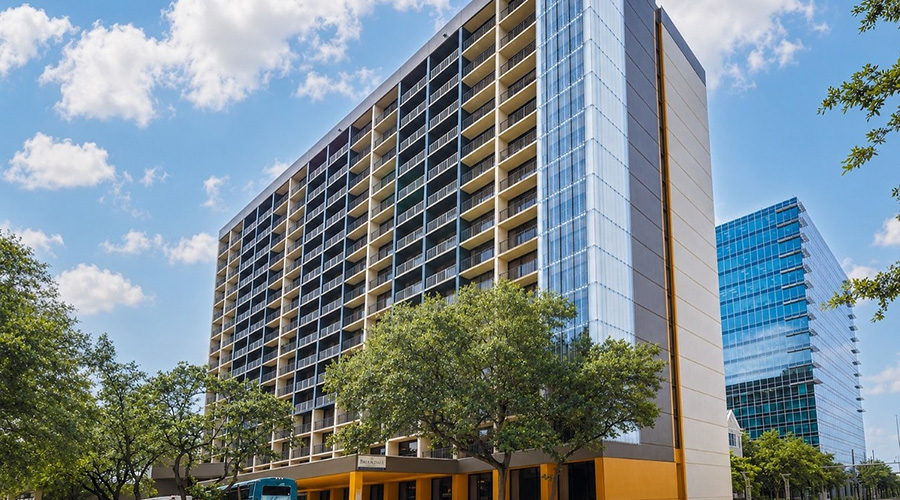 Brookdale Senior Living Announces Acquisition of the Brookdale Galleria Community