The dramatic transformation of a vacant 1980s suburban office building into a world-class cancer treatment center is giving Central and Southern New Jerseyans a new option for care closer to home.
Designed by the New York office of global architecture firm Perkins+Will, Memorial Sloan Kettering (MSK) Monmouth blends evidence-based design principles, such as views to nature and abundant natural light, with the state-of-the-art cancer care that patients have come to expect from MSK. It is a radical makeover from a drab and dreary corporate setting to a warm, soothing, and even uplifting experience for cancer patients when they need it the most.
“This wasn’t just a facelift of an existing space; we fundamentally changed the building’s insides,” says Robin Guenther, project director and principal at Perkins+Will.
Evidence-Based Design for Healing
What started as a 400,000-square-foot rectilinear office building with little to no natural light at its core, a private office-lined perimeter that obstructed shared views to the outdoors, and generally poor accessibility is now a light-filled, welcoming space with undulating interior walkways and views to nature around almost every turn. This is important, as a growing body of research shows that biophilic design, or design that connects users of the built environment with nature, improves healing.
“When you’re a cancer patient and you enter a typical cancer treatment facility, it’s as though you’re cut off from the rest of the world, from nature. Life freezes. At MSK Monmouth, we strived to bring the natural world back to the patients: they can see the seasons outside, they can see the sunlight, they can remember that they are, in fact, still very much a part of the world around them,” says Ted Shaw, architectural designer and associate principal at Perkins+Will. “And that’s a very important part of the healing process.”
To usher in natural light and provide panoramic views to the outdoors, Perkins+Will cut into the existing office building and created a large, daylit courtyard. The designers then created a series of glass-enclosed pedestrian bridges that cross the courtyard; one such bridge is the center’s main entrance, which follows the east-to-west arc of the sun to maximize daylight exposure. Inside, office spaces along the window-lined perimeter of the building were removed to create a seamless glass wall and pedestrian corridor overlooking a wooded ravine.
Additionally, each of the center’s 18 infusion therapy rooms faces a window to the outdoors, providing a direct view to nature. This is a rare bonus for patients who typically undergo hours of chemotherapy in windowless interior spaces, sometimes even underground.
“The infusion suite at MSK Monmouth is one of a kind—truly,” says Jason Harper, medical planner and associate principal at Perkins+Will. “When planning the layout, we made it our absolute priority to give patients a direct line of sight toward the outdoors without compromising the direct line of sight to and from the nursing station. We wanted to give patients a positive, hope-filled, and humane experience at a time when they’re feeling down, both emotionally and physically.”
The Comforts of Home and Hospitality
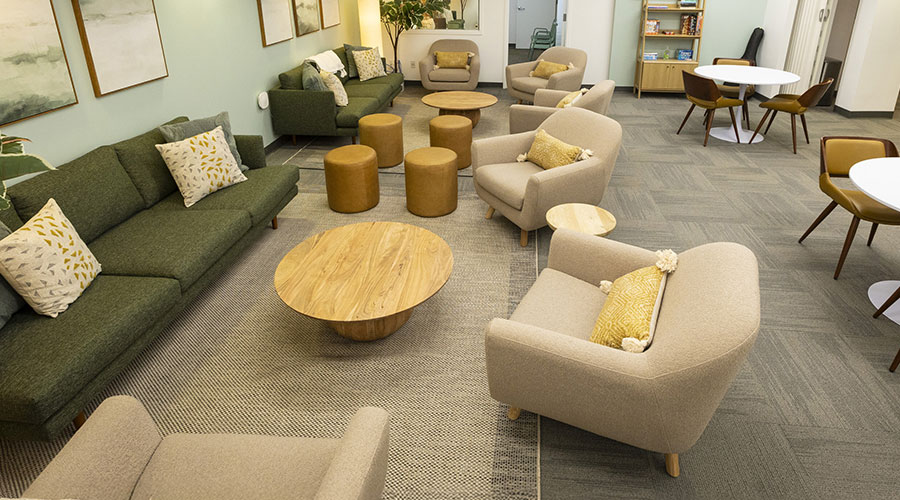
The interior design of MSK Monmouth also draws on elements of hospitality to ensure the comfort of patients and their families at every phase of cancer treatment. The traditional (and often dreaded) waiting room has been replaced by a series of “micro experiences”: welcoming parlors; dens with lounge chairs and TVs; and libraries with stocked bookshelves and iPad bars. Peppered throughout the public areas, these spaces provide room for everything from respite, reflection, and family gatherings to reading, channel surfing, or browsing the internet.
Even the colors and textures of the furniture, fixtures, flooring, and other interior materials—from patient changing rooms and exam rooms to the micro experiences—evoke a sense of calm, earthiness, and tranquility to promote relaxation and ease anxiety. Televisions, Wi-Fi connectivity, and adjustable lighting and temperature controls in each of the infusion rooms give patients a bit of added comfort.
“When you’re a cancer patient, you’re forced to give up control over certain aspects of your life—control of your time, your body, your daily rituals. It’s already a scary time, and that loss of control only contributes to the fear and anxiety. So we made a concerted effort to do whatever we could to help mitigate that sense of loss of control,” says Carolyn BaRoss, interior designer and principal at Perkins+Will.
The design and planning team carried out a study to evaluate which areas, in a healthcare setting, cancer patients might feel most vulnerable, uncomfortable, or stressed, BaRoss says. Combined with MSK’s own research, the results of the study led to the team’s emphasis on warmer, softer, more “humane” changing rooms, exam rooms, consultation rooms, and infusion therapy suites.
Three distinct entries to MSK Monmouth also help eliminate the sense of frenzy and hurriedness that patients often experience in busy healthcare settings. One entry accommodates general use; another entry serves daily radiology and oncology patients; and the third entry is dedicated to caregivers, practitioners, and other hospital staff. This sequencing ensures that patients are always warmly received upon entering the facility, that staff are able to get to and from their destinations without interruption, and that foot traffic in all areas of the facility flows efficiently.
“MSK already has a very high bar when it comes to excellence in cancer care and patient experience, but the new Monmouth outpatient center defines the next generation of MSK’s regional cancer treatment facilities,” says Guenther.
For more information, visit www.perkinswill.com.

 Designing Healthcare Facilities for Pediatric and Geriatric Populations
 Kaiser Permanente Announces New Hospital Tower at Sunnyside Medical Center
 Building Disaster Resilience Through Collaboration
 Amae Health Expands to New York City
 Hospital for Special Surgery Opens Two New Facilities in New Jersey